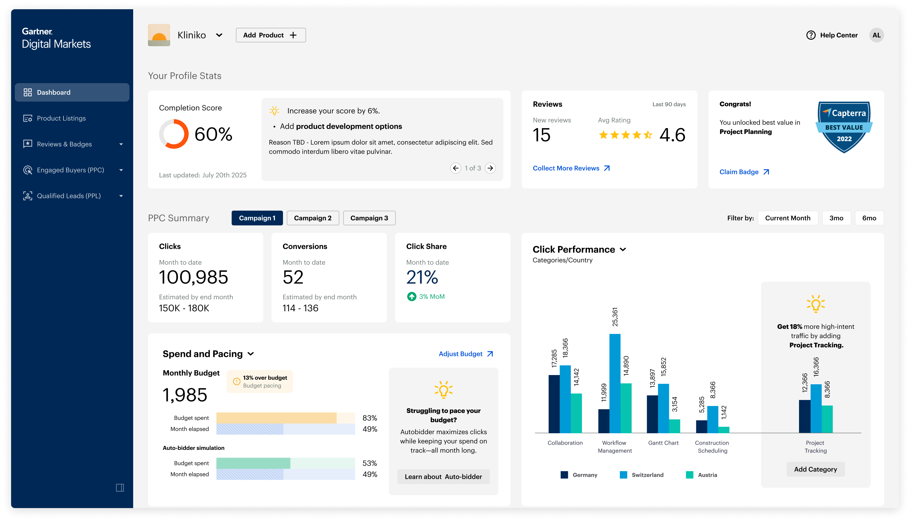
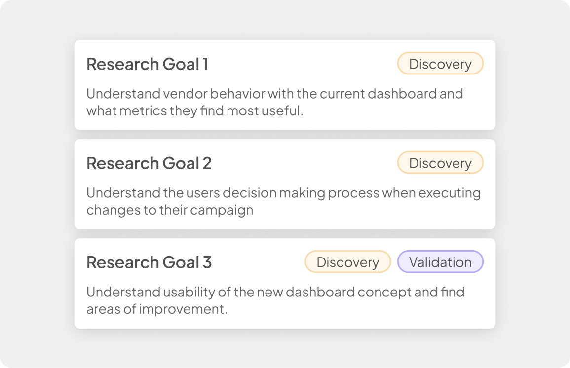
V0 Module Breakdown
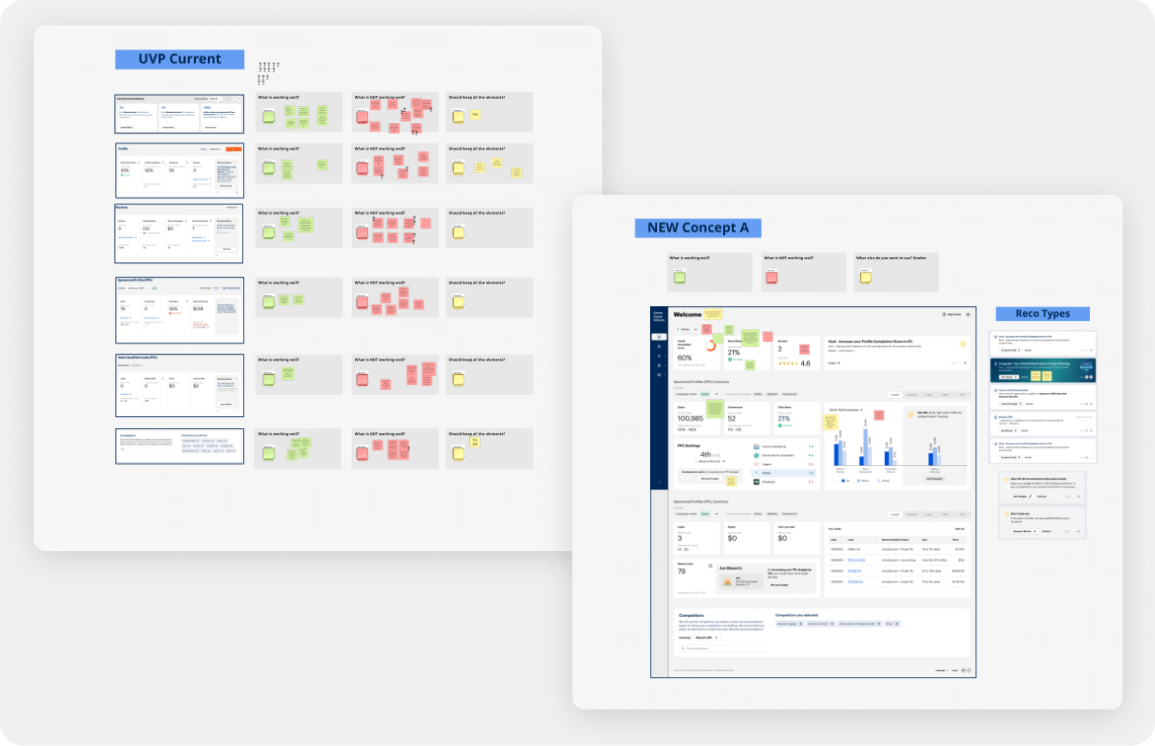
This is where the heavy design work began. We needed to create a new modular layout for the dashboard that introduced clear visual sections while still staying within pre-established guidelines from product executives. The modular approach had to be flexible enough to support new modules after MVP and retain key design system elements from the previous version to enable faster delivery.
"In-context" Recommendations
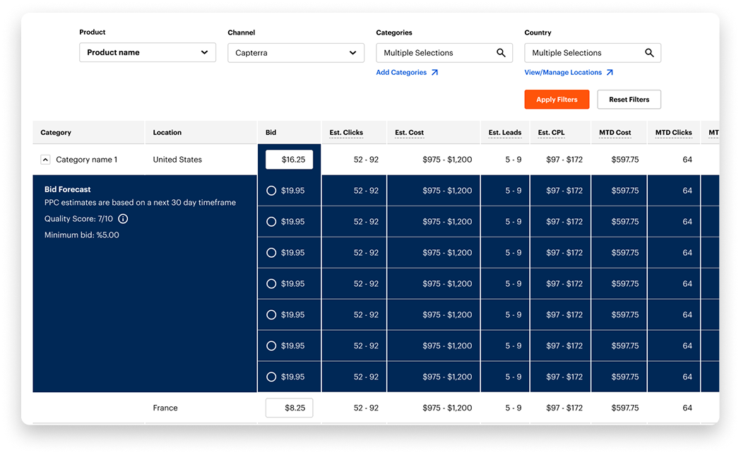
Recommendations are a core part of the dashboard and a major revenue driver because they encourage vendors to expand into new categories or increase budget. Changing these modules carried risk, but we saw a clear opportunity to strengthen them.
We explored making recommendations more compelling by placing them directly inside data visuals so the opportunity was shown in context rather than stated.
The final concept highlighted how much additional traffic a vendor could gain by expanding into new categories.

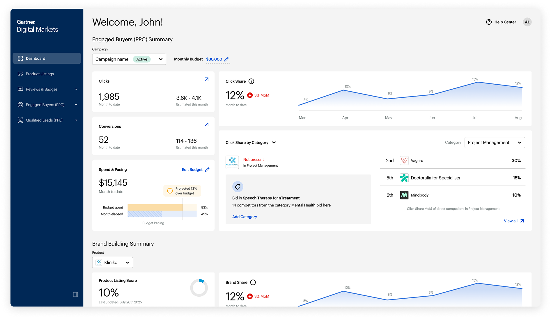
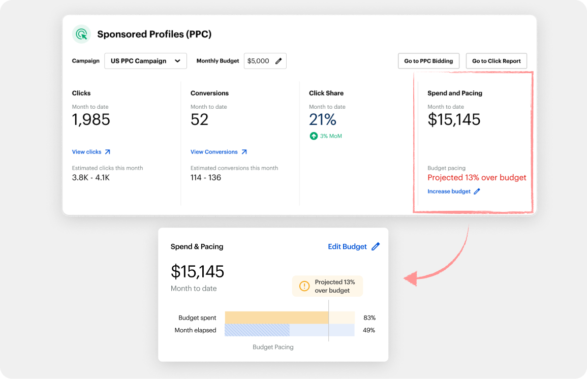
Helping Users Interpret
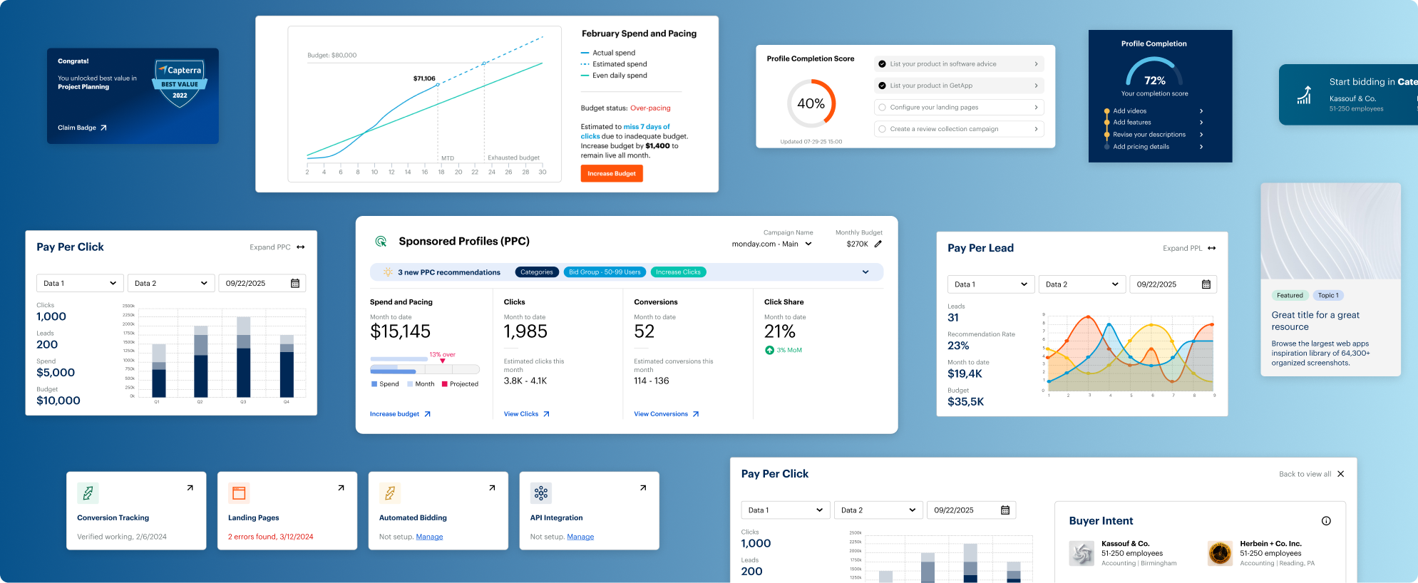
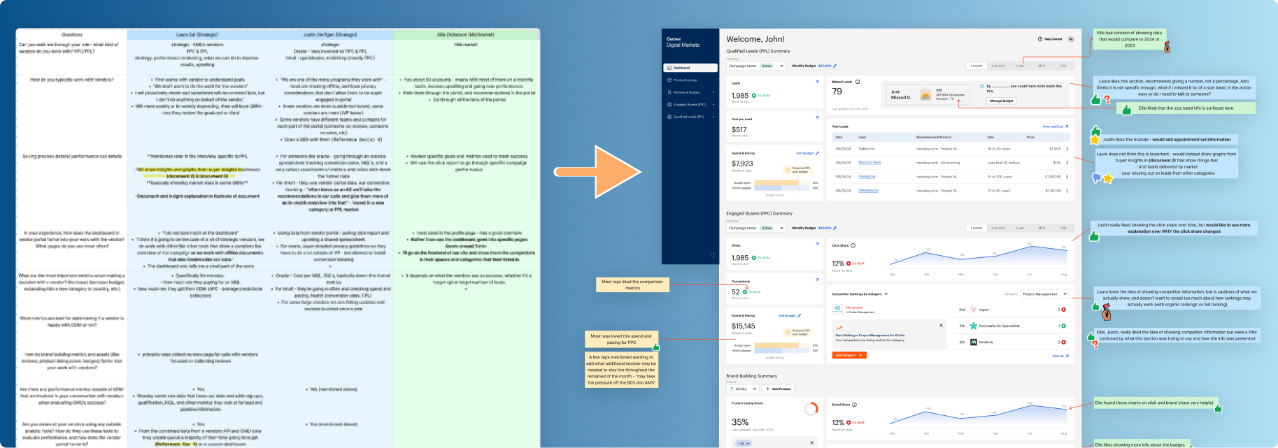
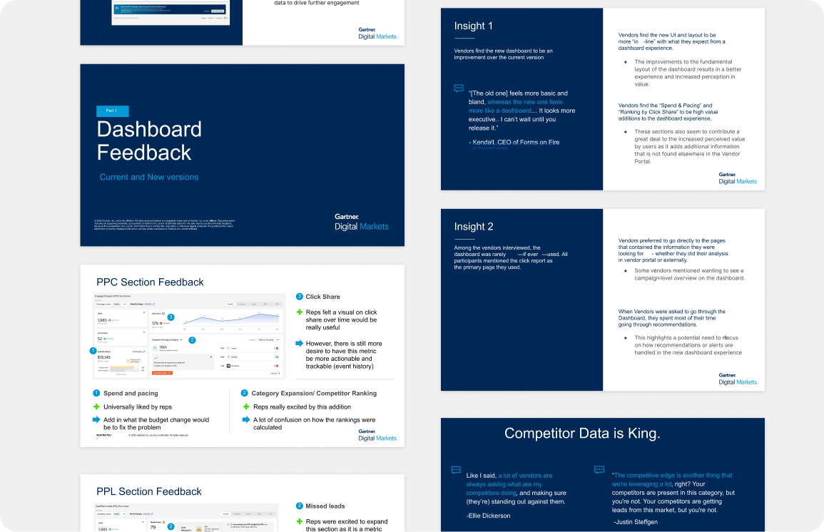
Spend & Pacing
Spend and pacing is a critical part of the GDM model. It represents how much of a vendor's budget has been used at a given point in the month. If users spend too much too early or too little too late, they will not see the results they expect and may be less inclined to continue using the service.
This created another opportunity to support an easily misunderstood metric with a strong visual. The new design served as a simple temperature check and also encouraged users to enroll in an important feature called automatic bidding.
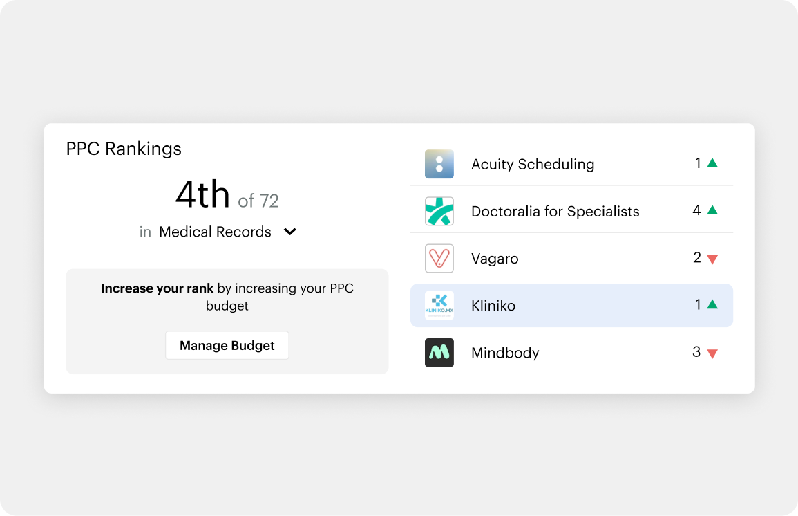
Gamifying Comepetition
One idea I pushed for was adding a lightweight competitor overview to drive more engagement.
We used publicly available data to show how a vendor compared to others in the same category.
The initial version displayed the user's ranking against key competitors, adding a small gamification element to motivate action.This was a feature I strongly advocated for because it allowed us to turn existing data into a simple and effective fomo driver.
V0 Full View
This was the first concept we aligned on, though it still needed more definition and validation. To refine the requirements for the dashboard, we brought it into a workshop with additional PMs and Sales Leaders.